The Chartio Website
Chartio is an online tool which helps companies visualize and share data. In the years I’ve worked with the Chartio team, I’ve helped them refine and expand their website several times.
The Challenge
- Communicate what Chartio could do, and what differentiated it from competitors in a crowded space
- Encourage visitors to start a free trial or engage with us

The first time the founder asked me to take a look at their main landing page, I talked with the team and identified a few things we could improve:
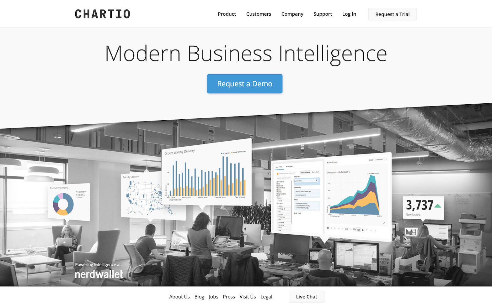
- The main headline on the homepage didn't explain much beyond "visualize and explore your data”. A good start, but almost every competitor does this too.
- The background screenshot did show what users could build, but didn't explain how much power and control you could have in building charts and dashboards. The image was also faded into the background, making it seem less like the main selling point.
- A more subtle issue for an unfamiliar visitor (but major for the company) was the use of an old logo. The company had a newer logotype they were starting to use, but had yet to implement it on their site.
- There were actually two more “pages” on this landing page. By that I mean there were essentially slides, with different background images, headlines and CTAs which a visitor could switch to only by using the arrow keys on their keyboard.
- Looking beyond the homepage, the site was clean, but there wasn't much excitement or visuals to really explain the selling points of the service.

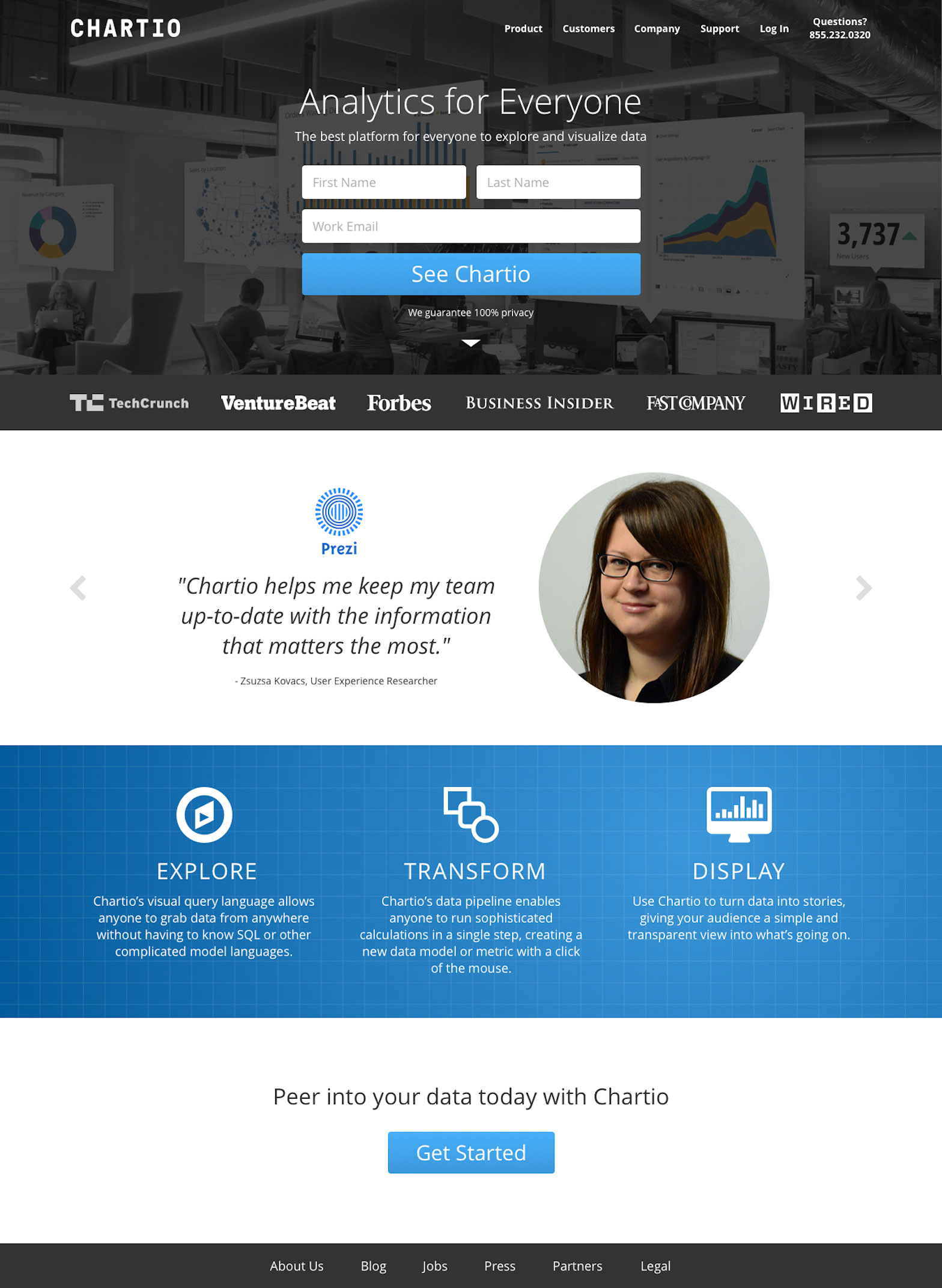
My First Chartio Homepage
My first attempt at reworking the homepage was to show more of the final result that set Chartio apart: teams using data and being able to access it on their own. I did this by working with Marketing and going to a customer’s office to take photos of a real working team. I added floating “screen thought bubbles” to the photo with charts and screenshots inside to illustrate how each person is able to access their own data with Chartio. I put the main headline on a white background for maximum clarity and started to unify the site’s type styles. I also angled the bottom edge of the white container to give the image underneath an "up-and-to-the-right" shape, echoing the progress of the team and the charts themselves (and the perspective of the thought bubbles).
Iterating, Iterating, Etc.
This new page addressed some of the straightforward issues (like using the right logo), and was a great improvement. Eventually, when resources were available again, we started experimenting with ways to push the page further. We added some customer quotes and a high-level overview of what one could do with Chartio. To help encourage trial signups, the signup form was brought onto the page to help show how easy signing up was.
After making and testing these major and minor iterations, I was able to convince the team the rest of the site was being left behind. The landing page was important, but still only one step in a journey. Visitors had so many questions, and we had plenty of resources, but it was all buried in a footer or on the blog. I wanted to help update and unify the branding and general structure, which would require more than updates to the homepage.
Leveraging Research
The Marketing team was also receiving help with positioning and messaging from an outside firm around this time, which meant there was a lot of user research data coming in I could use to my advantage. I worked with the consultants directly and we distilled all the research into an information architecture plan for the site which reflected what people were looking for. I used this as my map and started building a new site myself, while also taking a fresh look at the Chartio brand (and making it responsive).
The Results
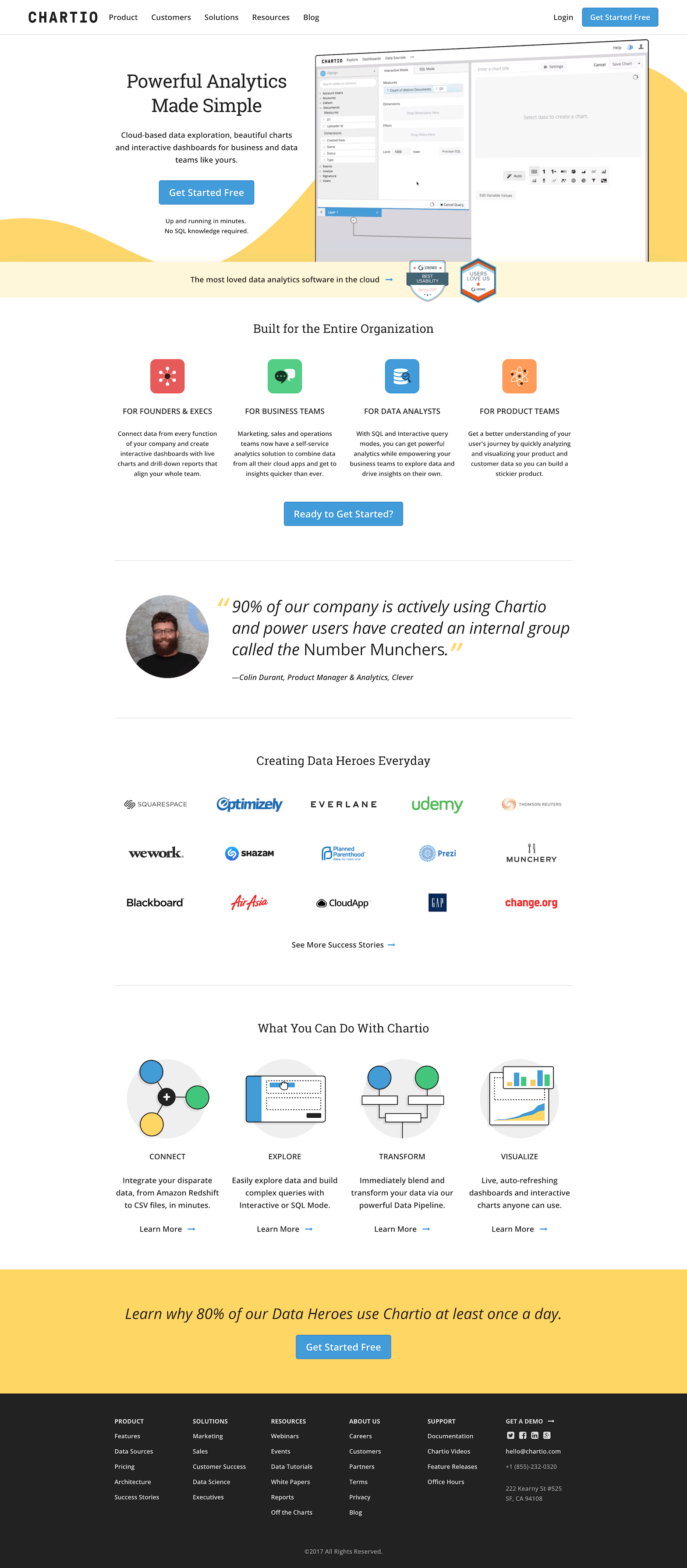
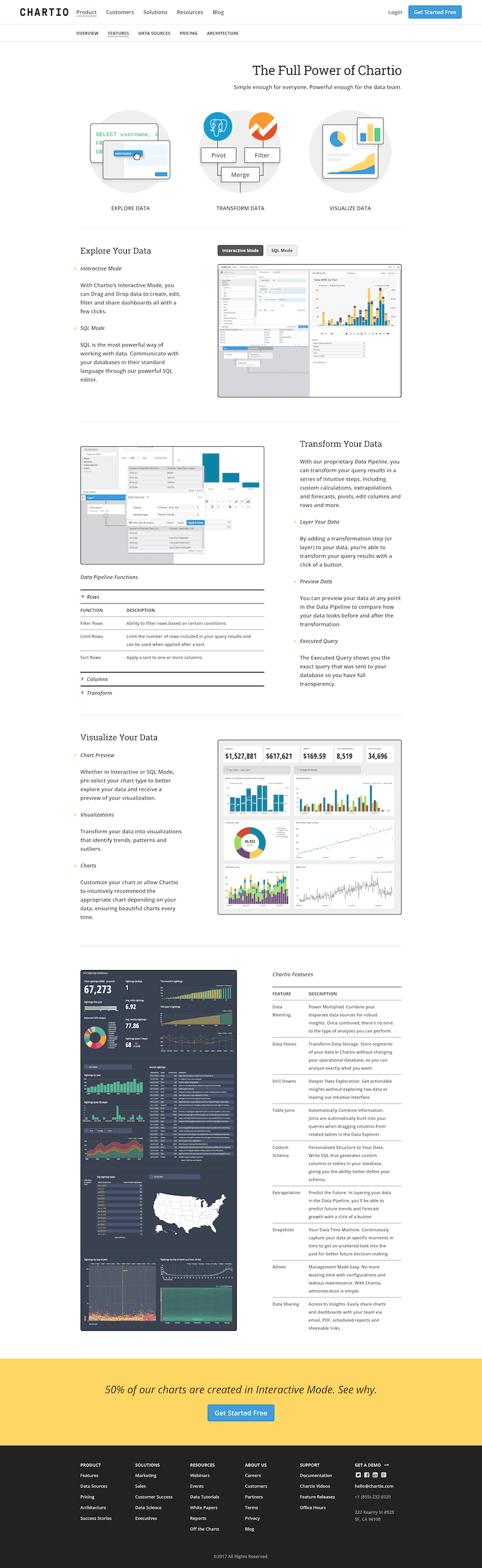
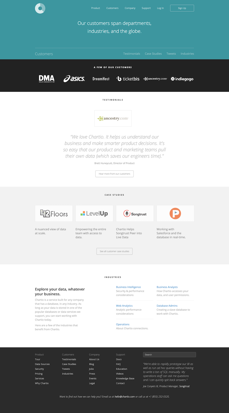
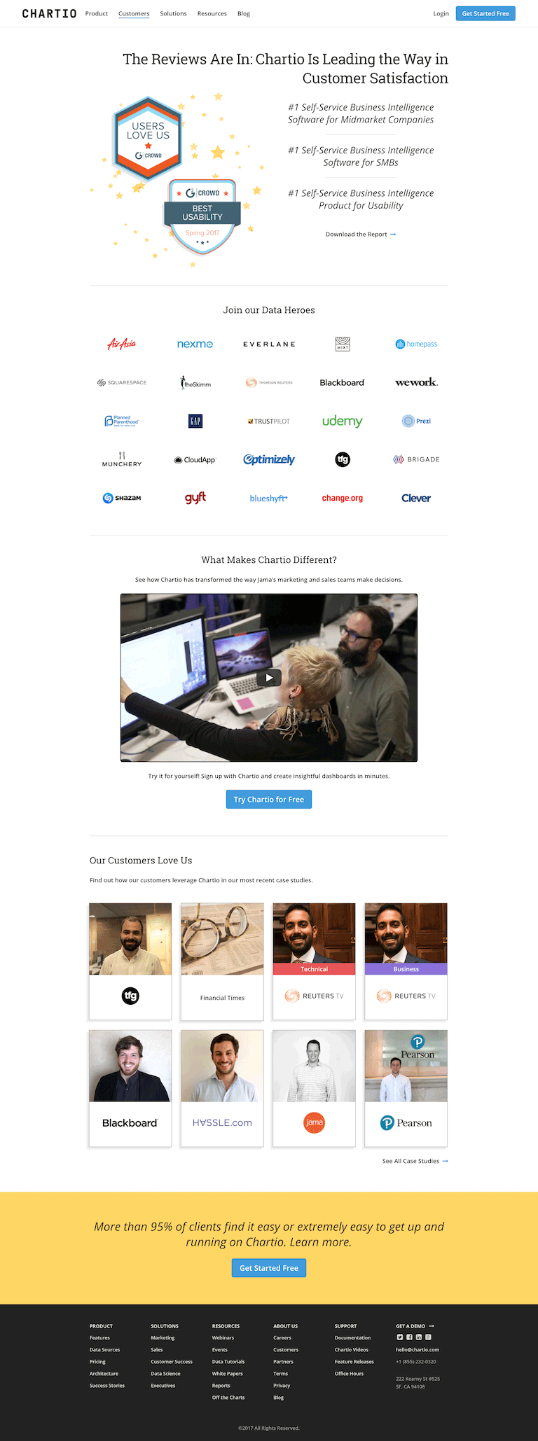
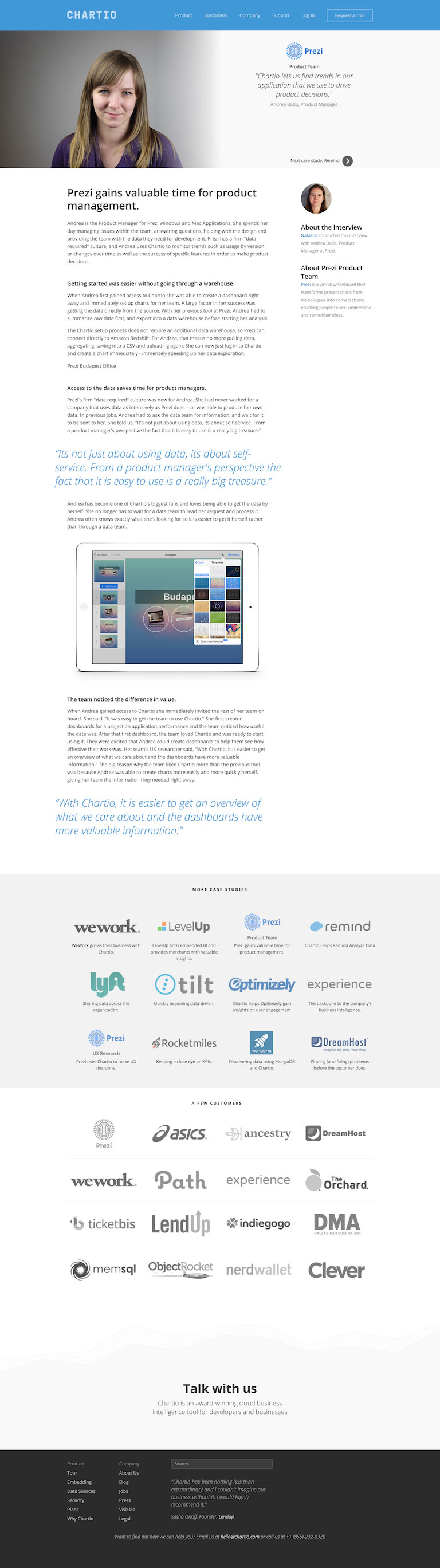
The redesign not only solved a lot of the issues with the homepage, but allowed us to surface the things people were looking for across the site. It also let me unify the look of the site and update the brand to be more clear and confident.
One fun thing to notice in this site, several elements, like the persistent CTA button in the top nav hanging out of the grid, or all the main headlines being right aligned, are meant to subtly pull our eyes “up and to the right” throughout the site.
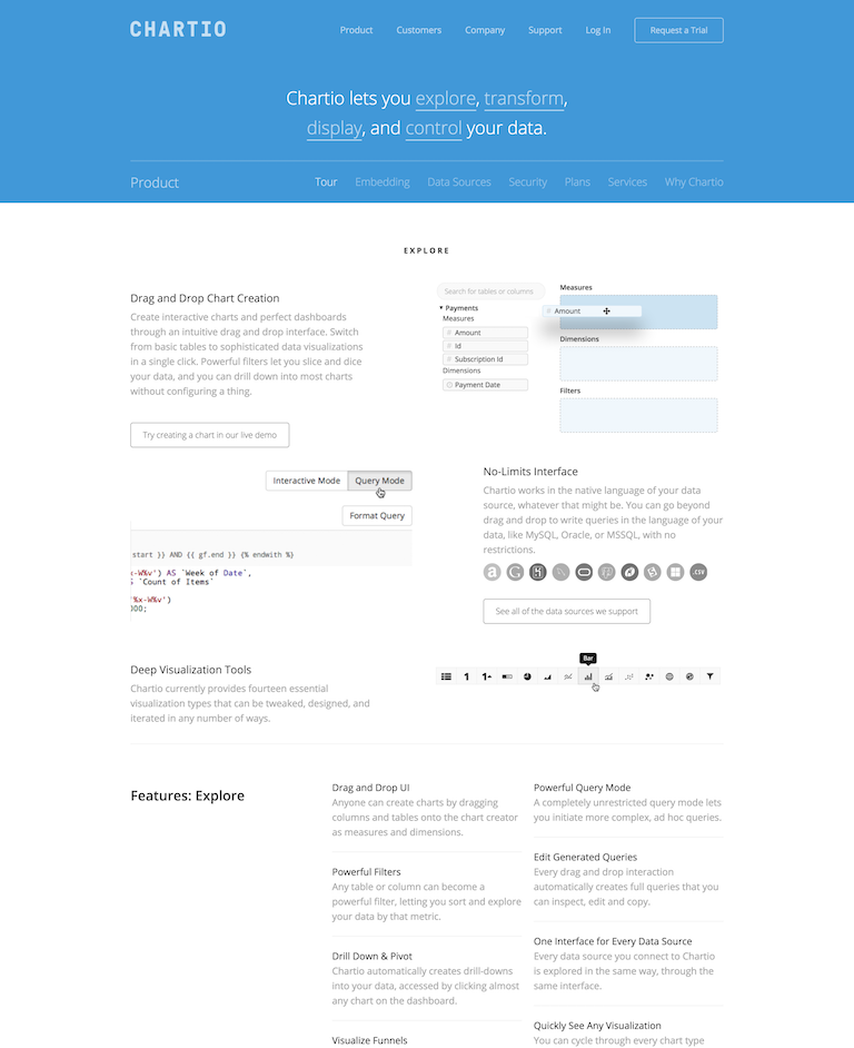
Since launching the new site, I’ve continued working with the Marketing team to test new variations and ideas to further clarify how Chartio can help companies. I’ve recently been leading some successful split tests throughout the signup process.