I spent my first few years with Chartio focusing largely on the product itself. I would make small improvements to pages as leadership needed, at most giving the home page an updated look, but I was eventually given the chance to start clean.
Chartio website and brand update (2017)
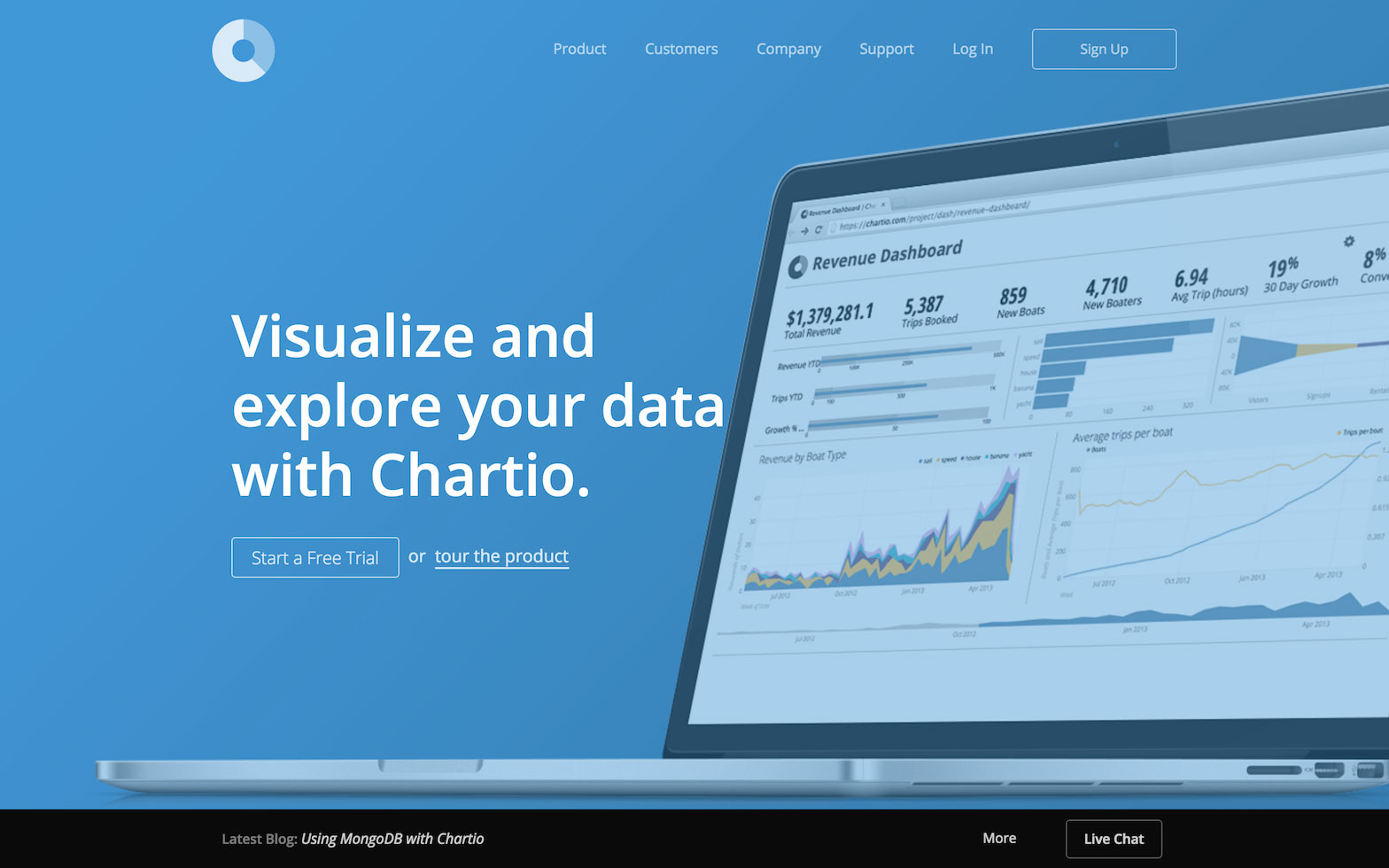 The chartio.com website when I was first hired (not my design).
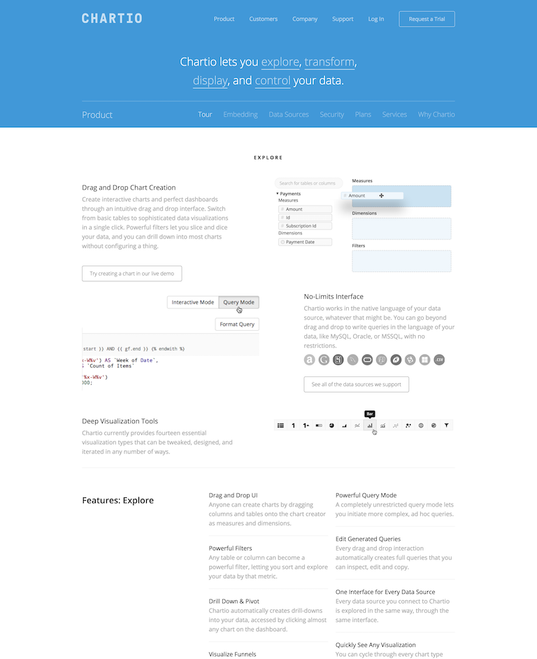 The original product page.
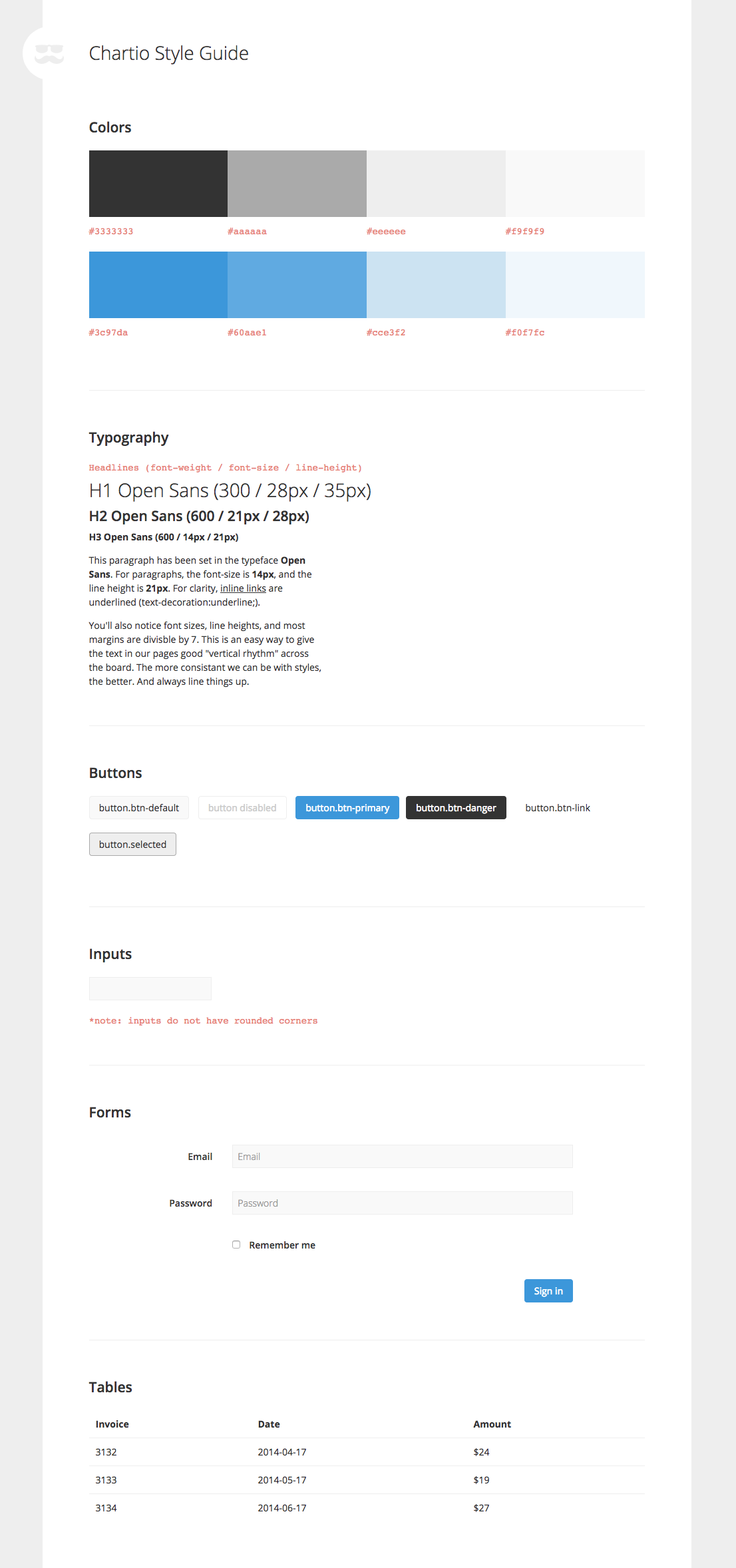 One of the first things I did when I was hired was compile a basic style guide the team could access.
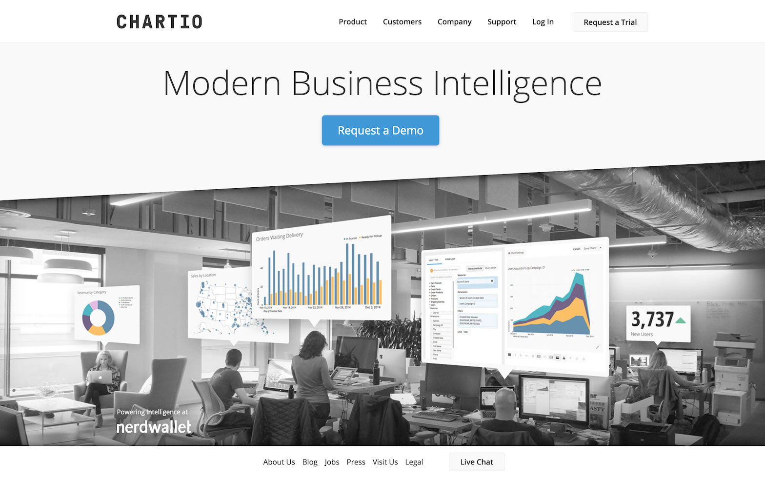 An early iteration on the homepage I launched in later 2014.
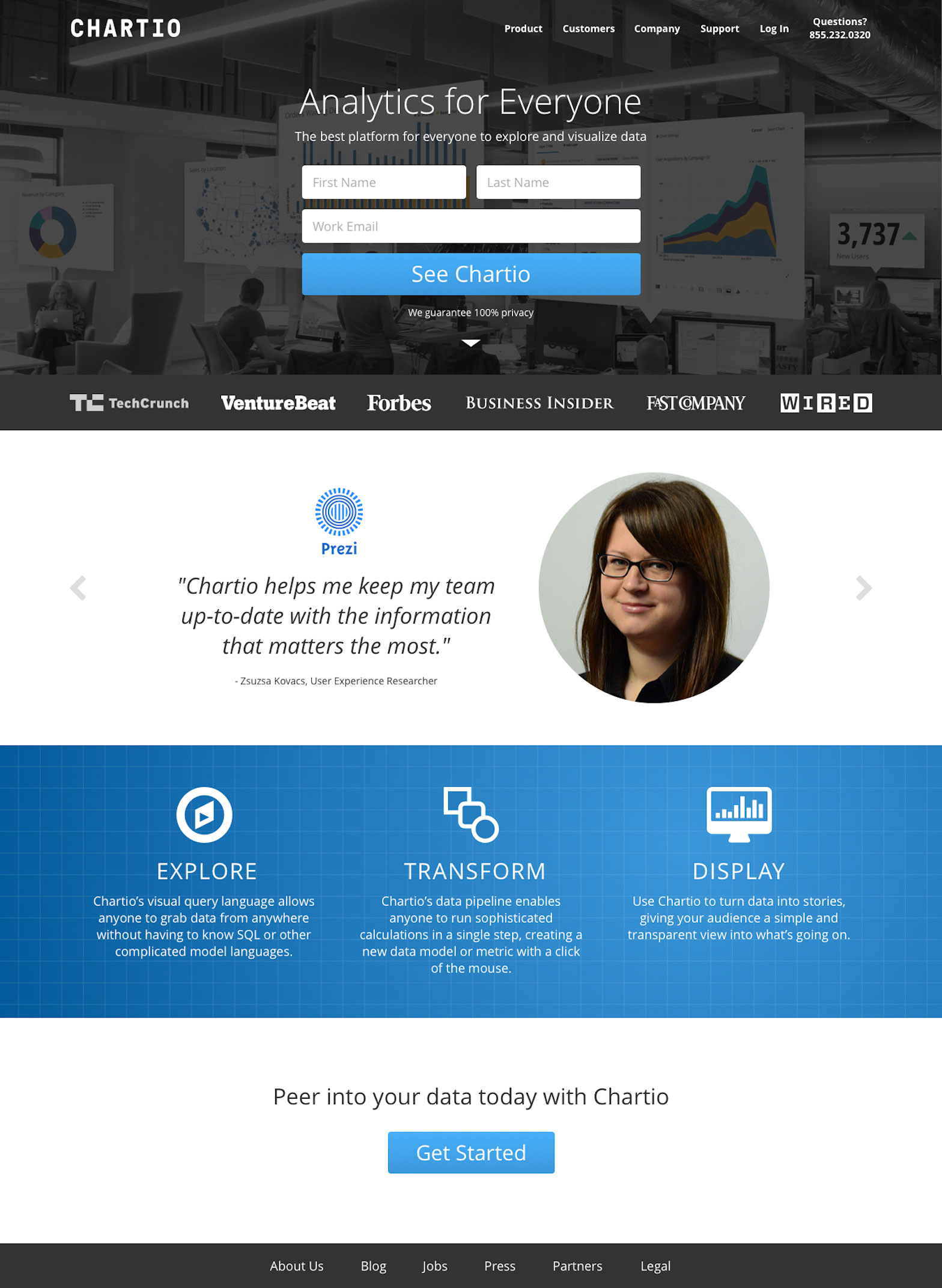 A later iteration from 2016. This version was largely based on feedback and requirements from user tests and the marketing team.
In early 2017, I redesigned and rebuilt the entire marketing website and created the first printed brand guide for new employees and partners to reference. I introduced Roboto Slab as a second typeface for headlines to bring a little bit of sturdy warmth and humanity into the picture.
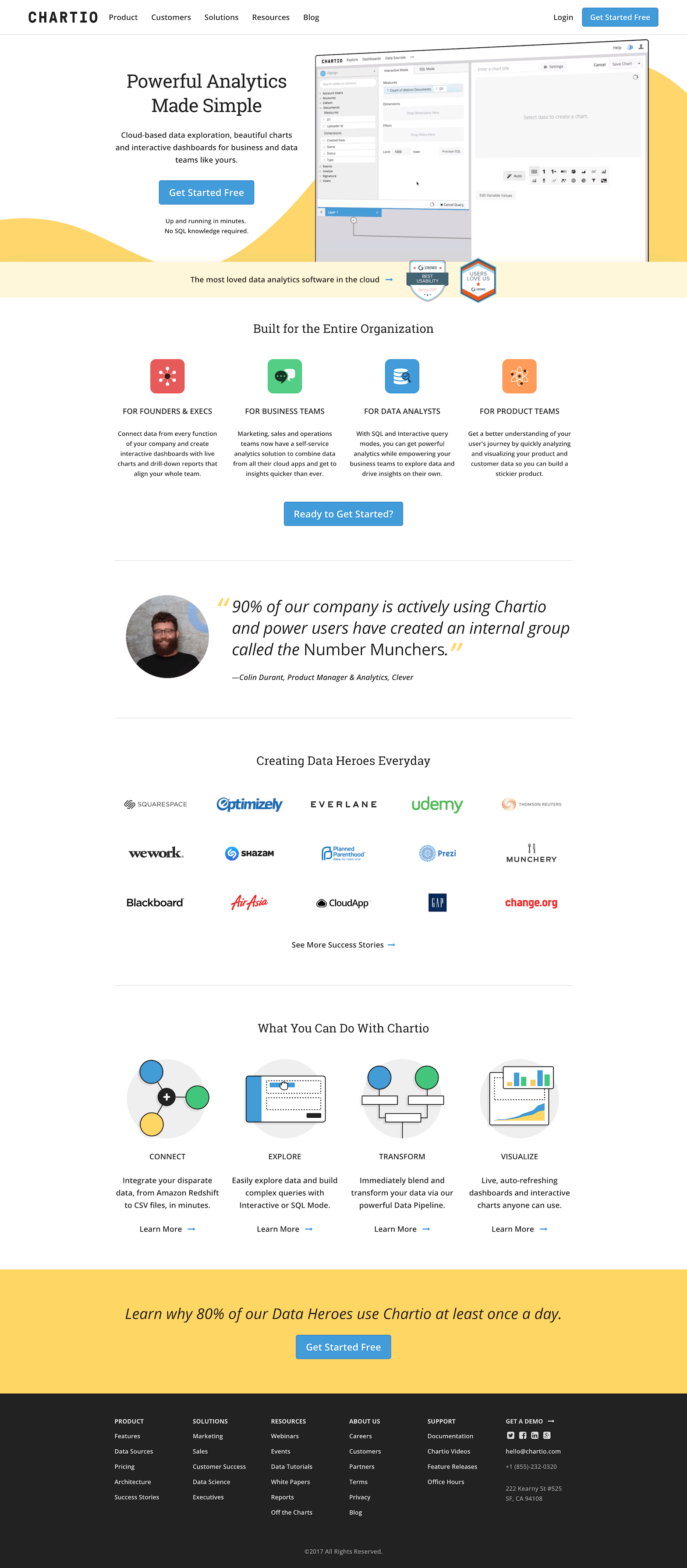 The new chartio.com. This design remained largely unchanged for about three years.
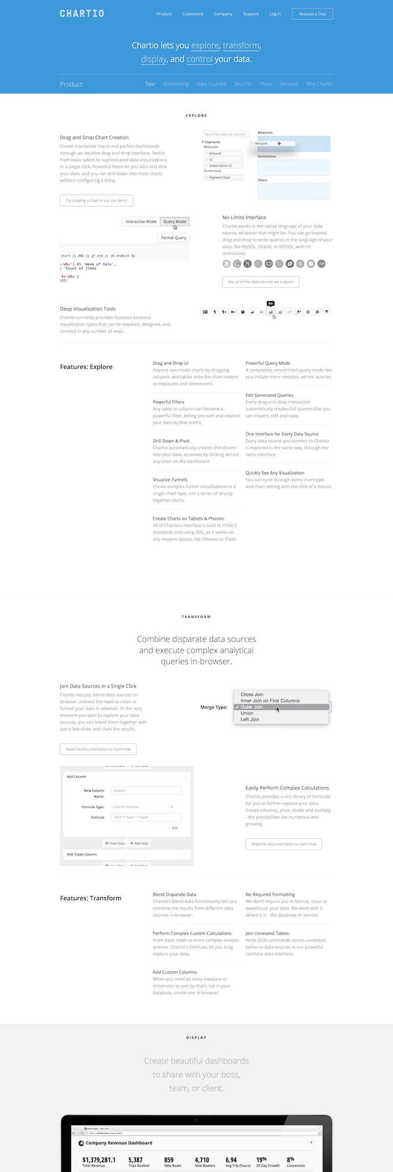 The old product page.
 The new product page.
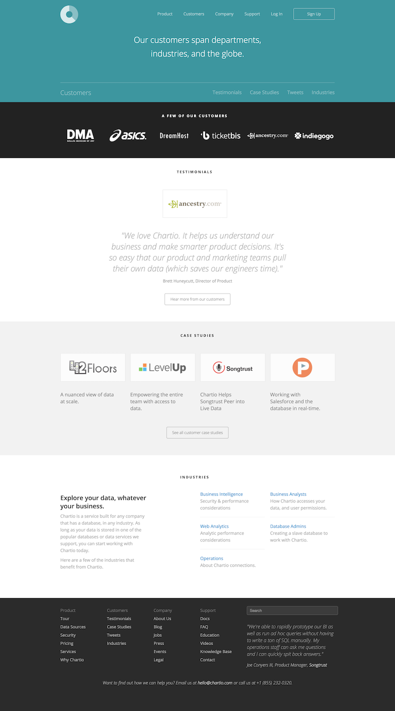 The old customers page.
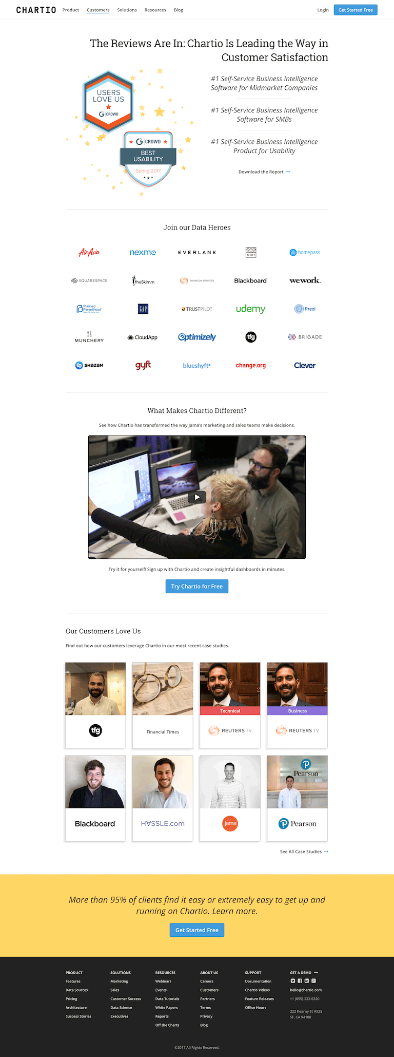 The new customers page.
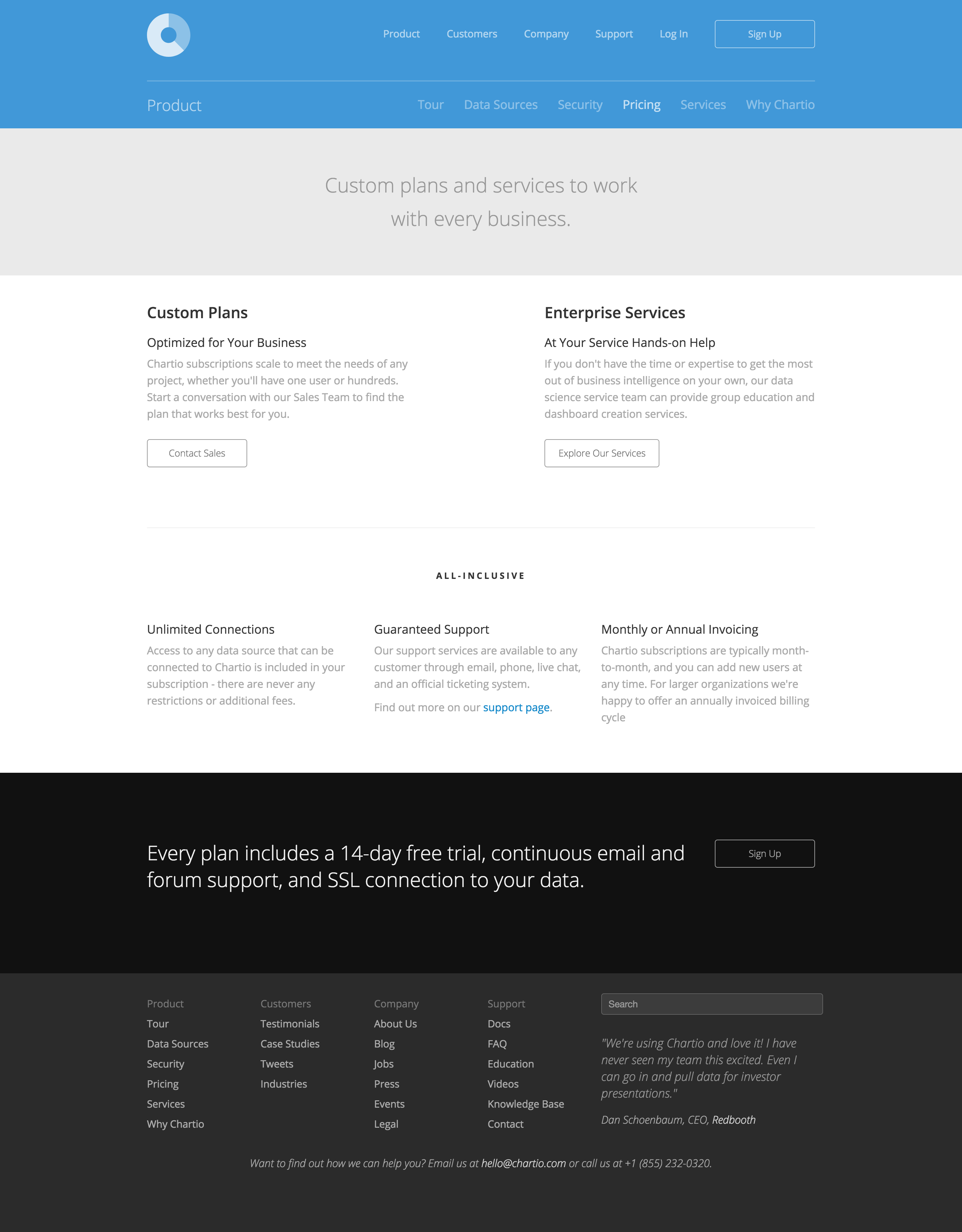 The old pricing page.
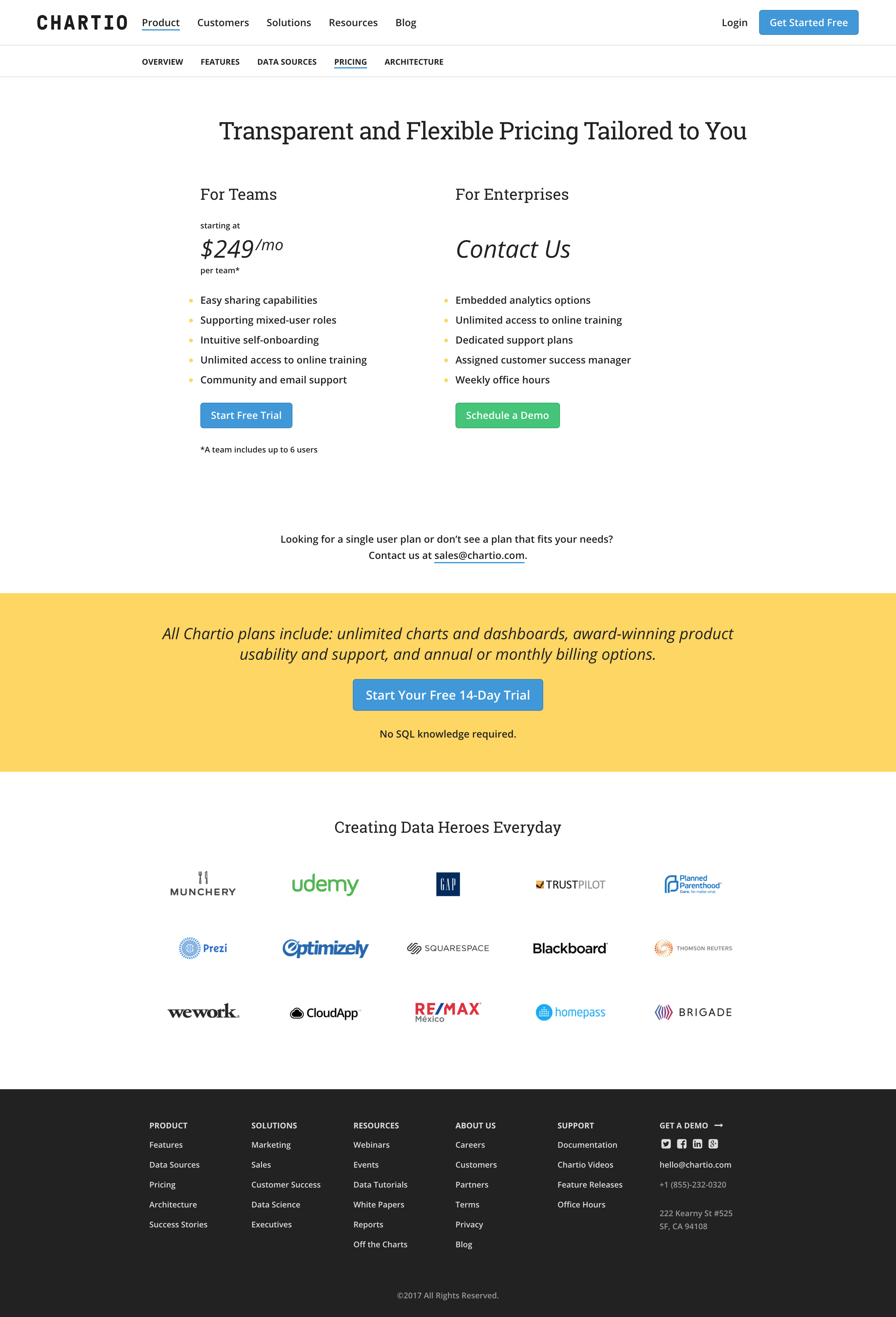 The new pricing page.
The single-word theme I kept in my mind throughout the project, and really my entire Chartio career, was “clarity”. In data visualization, clarity is paramount, so to me the branding of a data visualization company in a crowded and confusing market should be as clear as humanly possible.
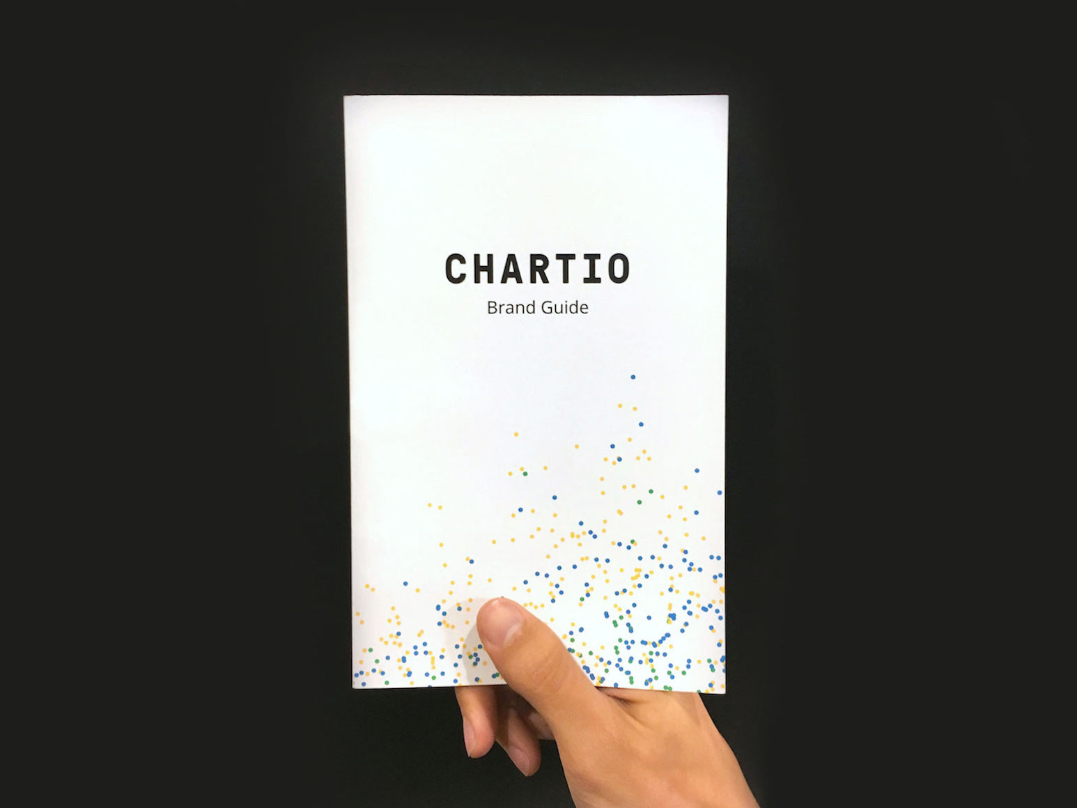 Chartio's first printed brand guide.
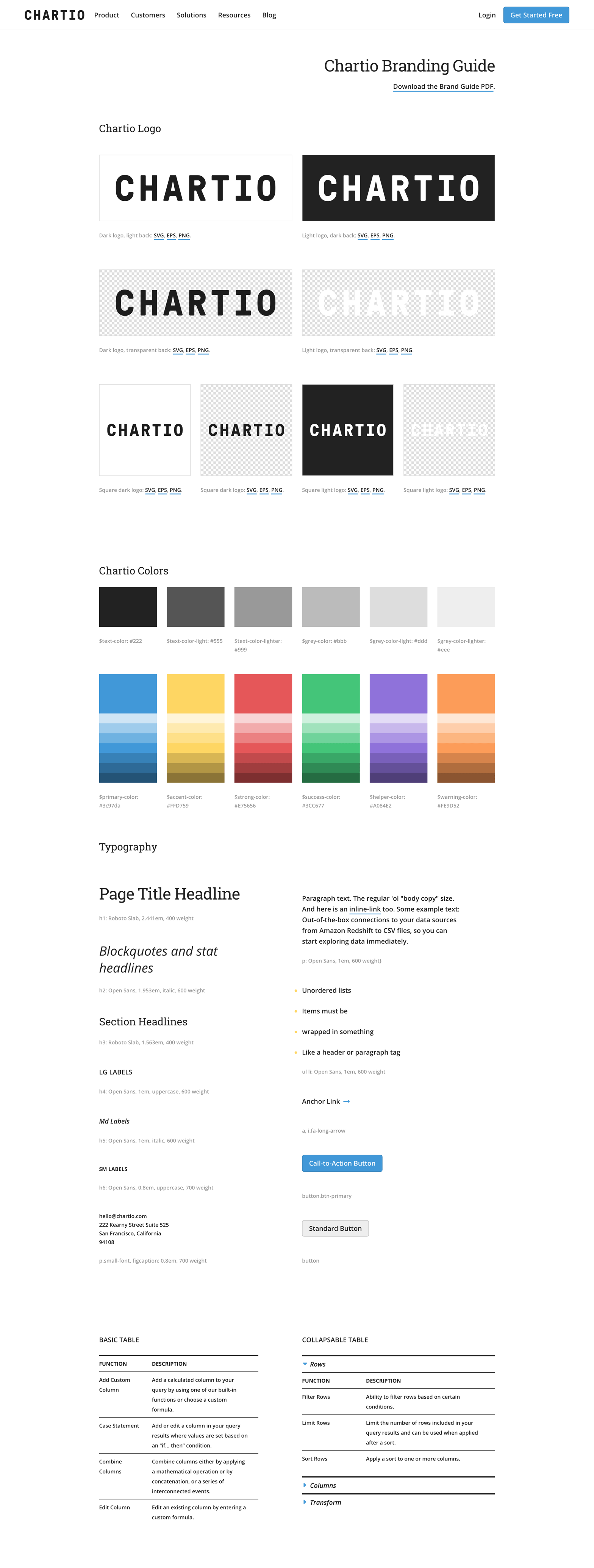 The updated and now-public brand page for employee and partner reference.
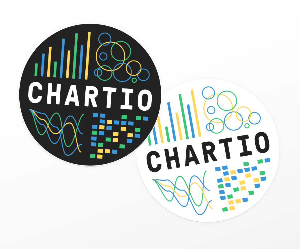 Chartio stickers using the new, brighter colors.
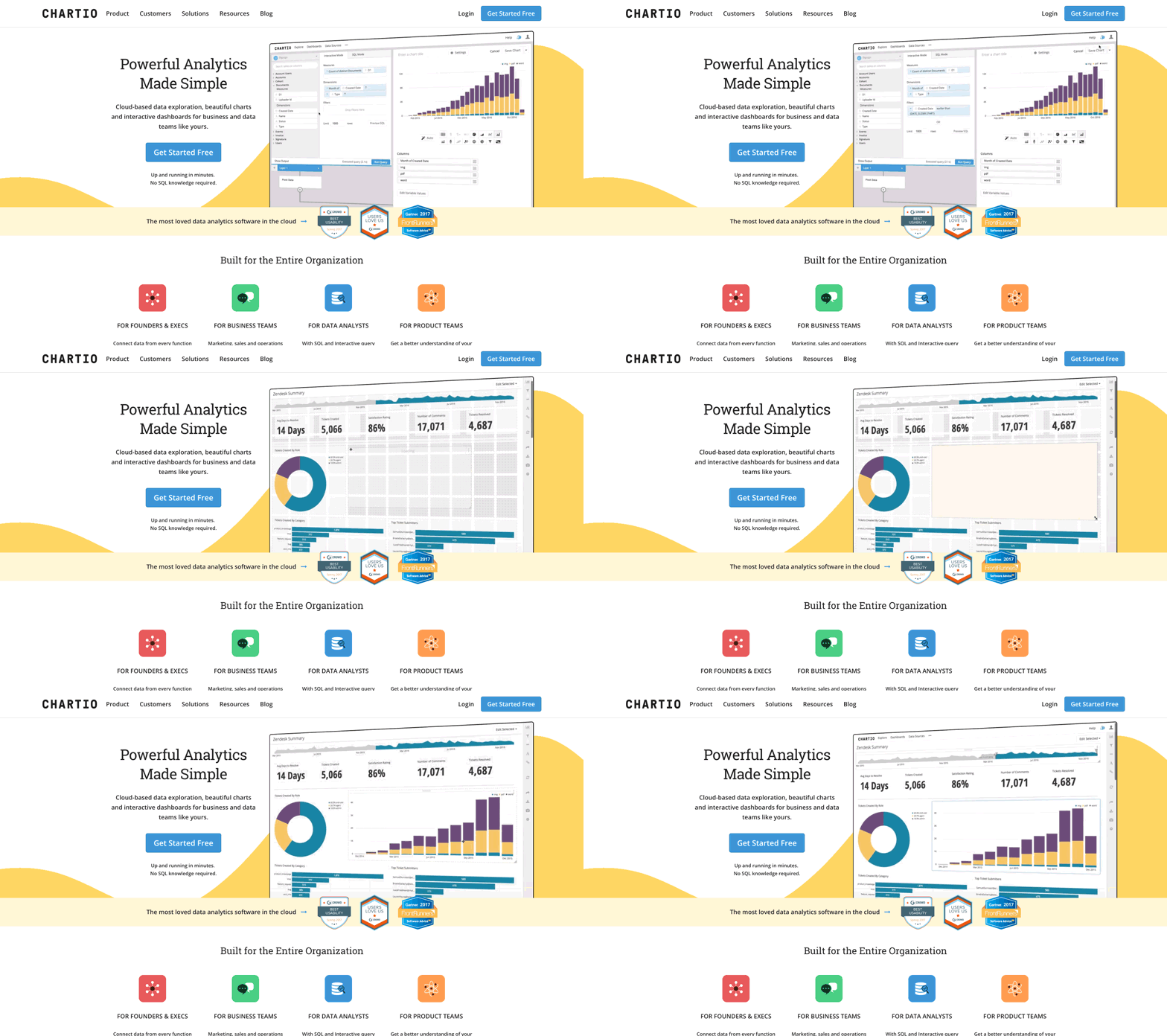 The homepage featured a looping, short video demonstrating how quickly a chart could be built and added to a dashboard in Chartio which played automatically.
The project resulted in a lift of new trials and helped introduce design into the company culture like never before. Handing a new employee a brand guide on their first day become a great way to signal both that design was important at Chartio, and who to go to with questions that may come up.
Thanks for taking a look. Reach out anytime. I hope you’re having a nice day :)Copyright © 2013-2020 Steven Lewis