Logos
Logos are so fun. They involve storytelling, typography, minimalism and marketing all at once. An entire mission statement has to be boiled down into a mark. Here are a couple logos I made for some budding new businesses.
Wild Science Bread Co.
Wild Science Bread Company is the home business of my good friend, Nick Malburg. He started out selling bread subscriptions and advertising through instagram and quickly decided he wanted an identifiable brand to help him stick.
I was excited to work on this logo for him, even more so when I heard some of the ideas he wanted to incorporate. The goal was to combine the ancient art of bread making with Nick’s precise yet experimental nature. He also brought some awesome examples of art and Pittsburgh brands he resonated with to draw inspiration from.
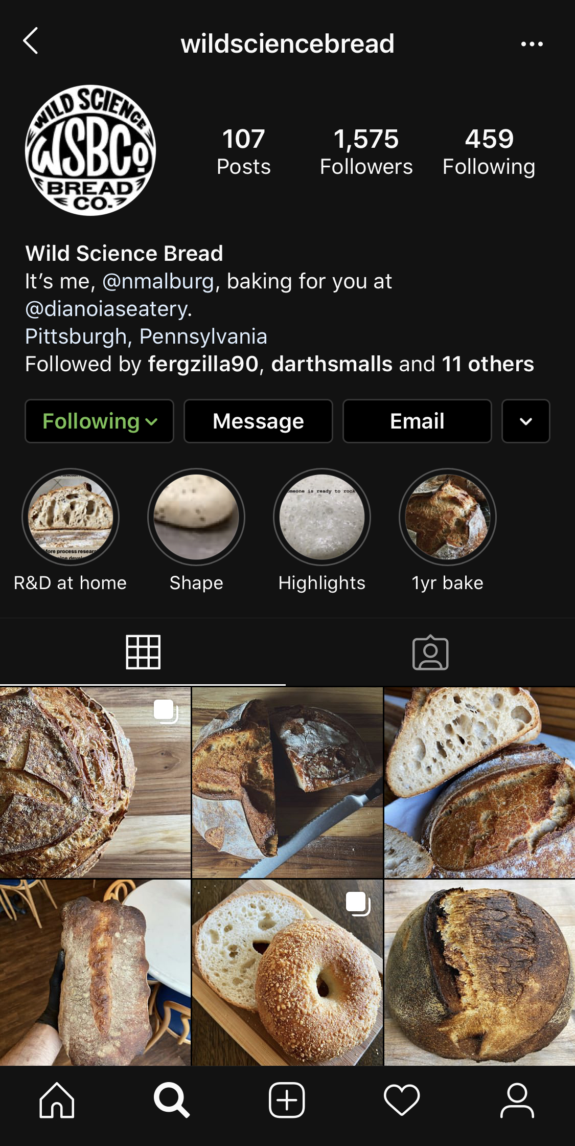 The logo in use on instagram.
Pipe Dreams Cupcakes
"Retro, but not too retro". That was my note after talking with my friend, Sara Sidelinger, about making a logo for her new bakery business, Pipe Dream Cupcakes. She would be selling small cupcakes from a new diner in my hometown, as well as doing wedding cakes and other special orders.
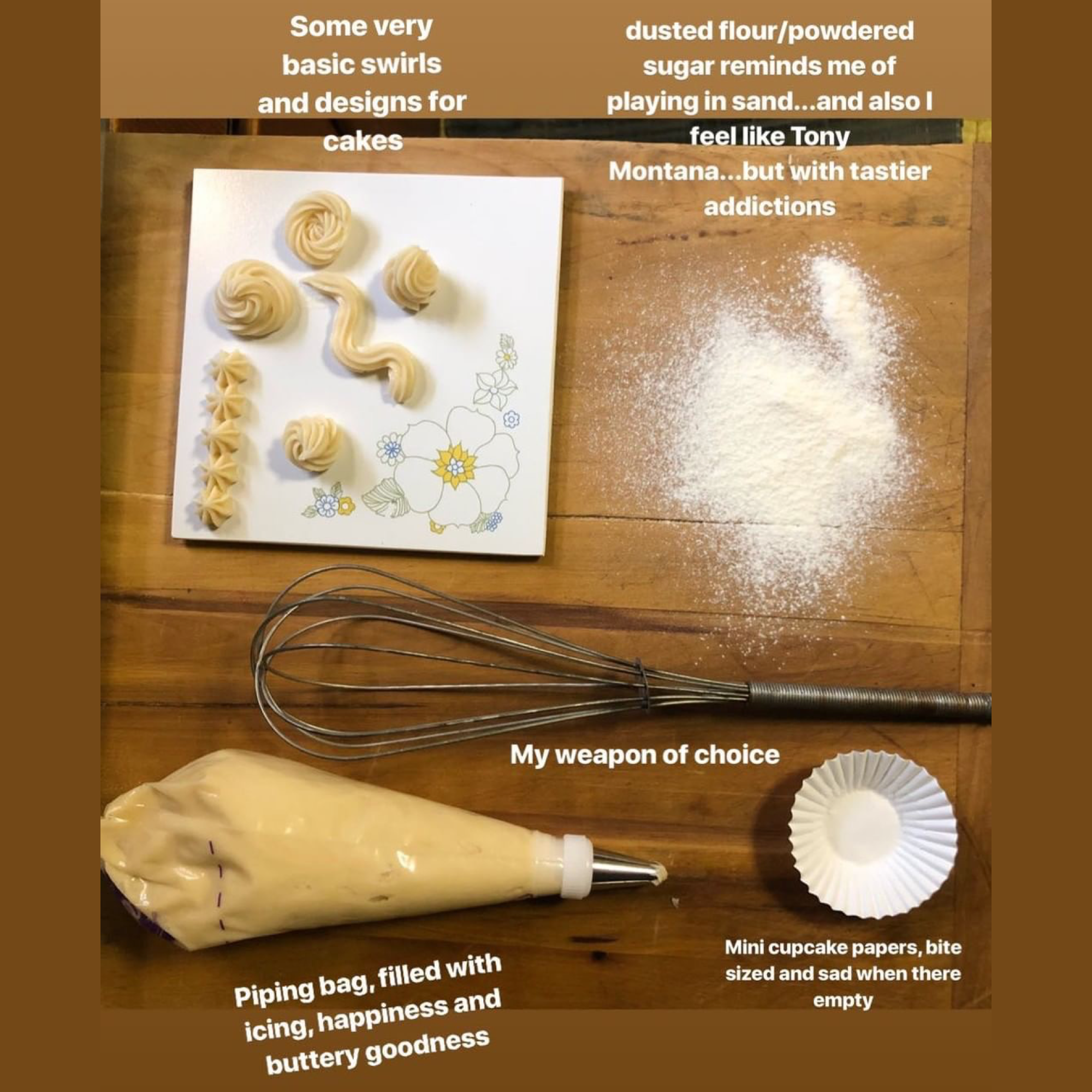 Sara was nice enough to share some pictures to give a preview into her process.
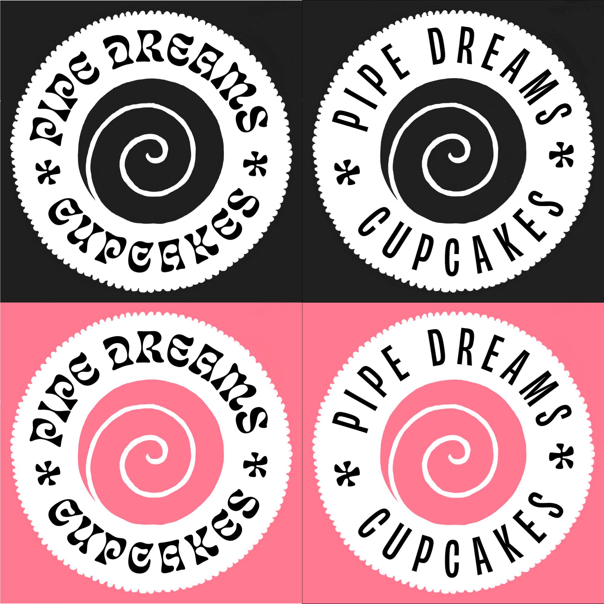
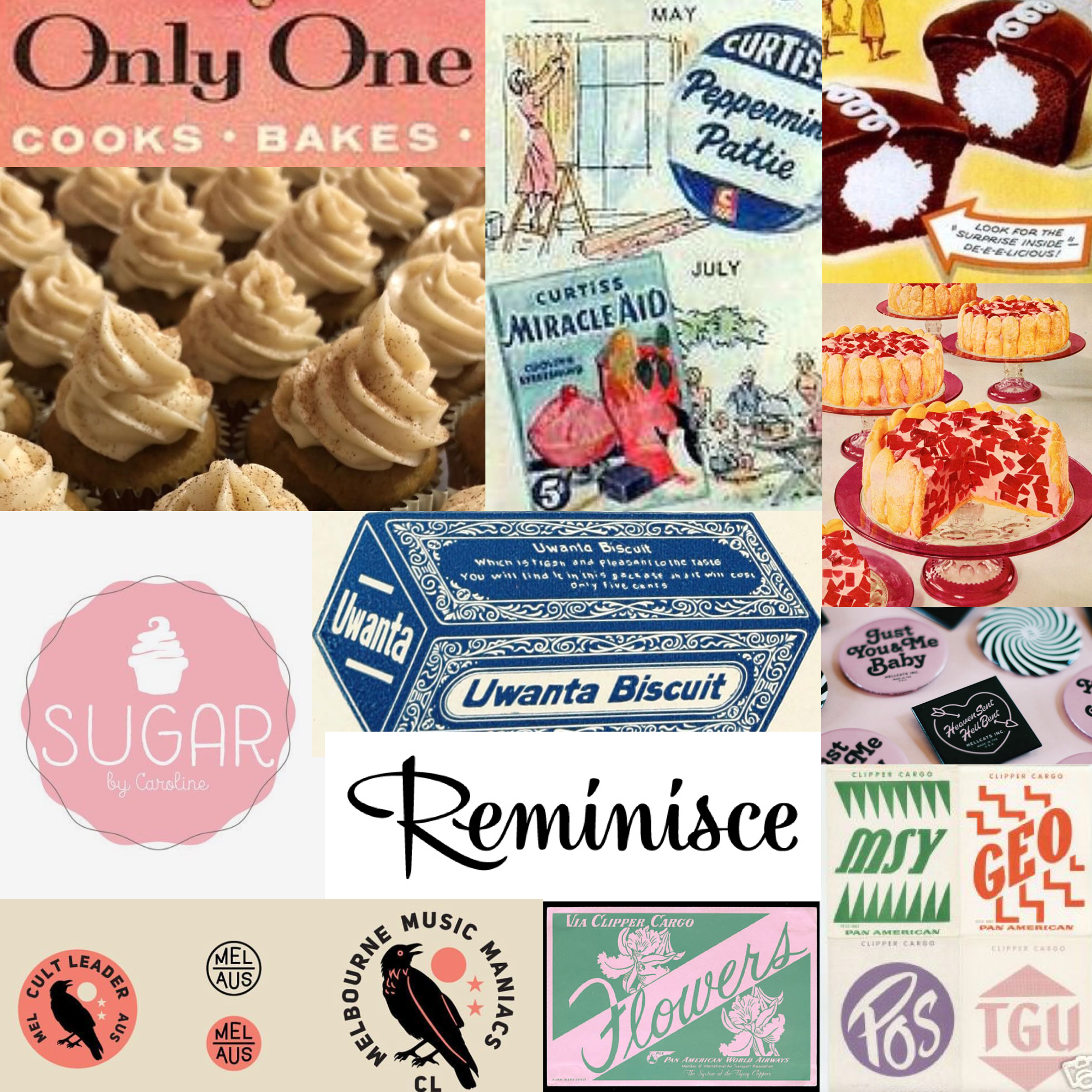 A moodboard I created for this project. Sara wanted the logo to feel "bold but feminine", and feel at home in a retro diner.
She takes pride in making all of her cakes from scratch, by hand, and doesn't even use stand mixers. I was struck by the satisfying spiral that occurs so often in the frosting.
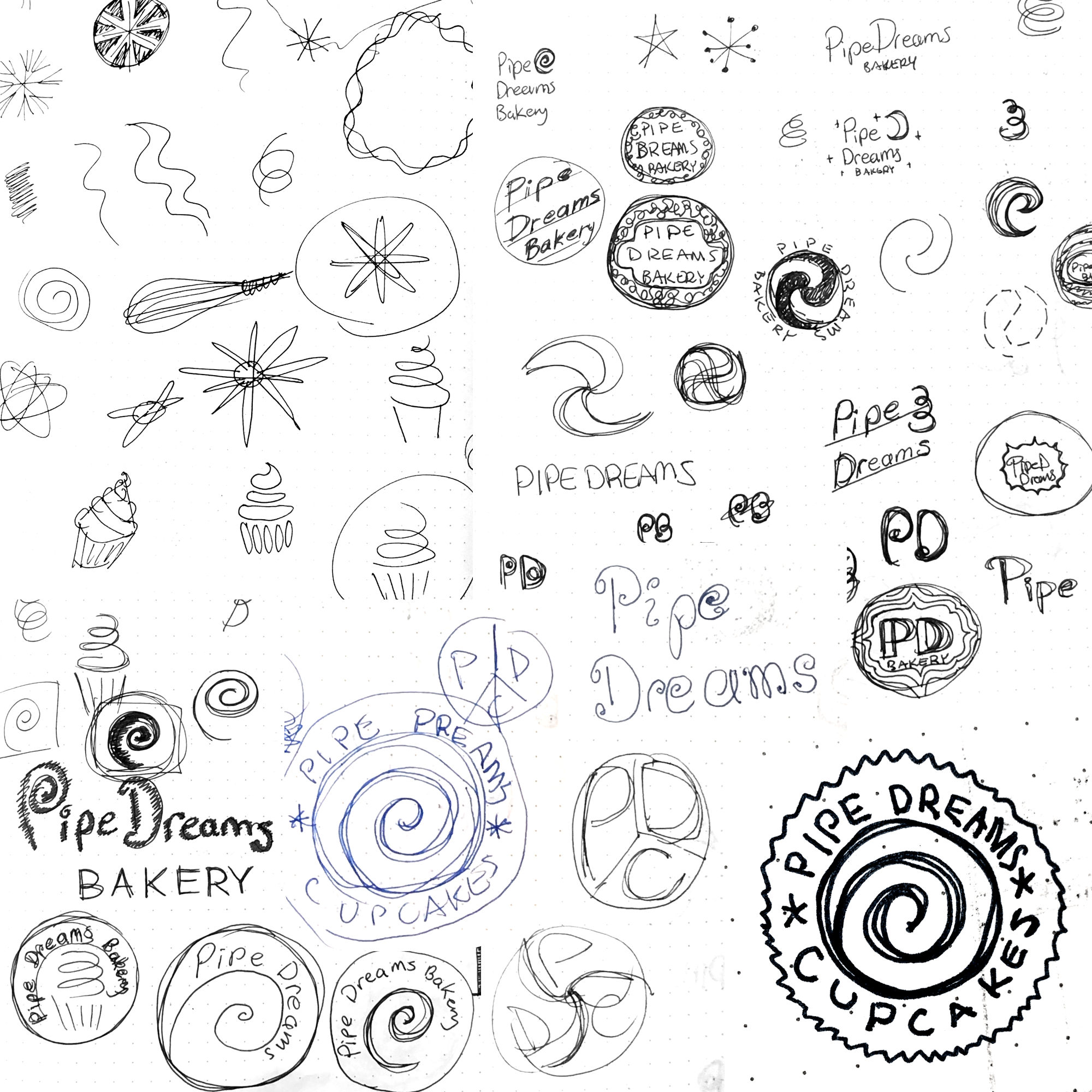 Initial sketches.
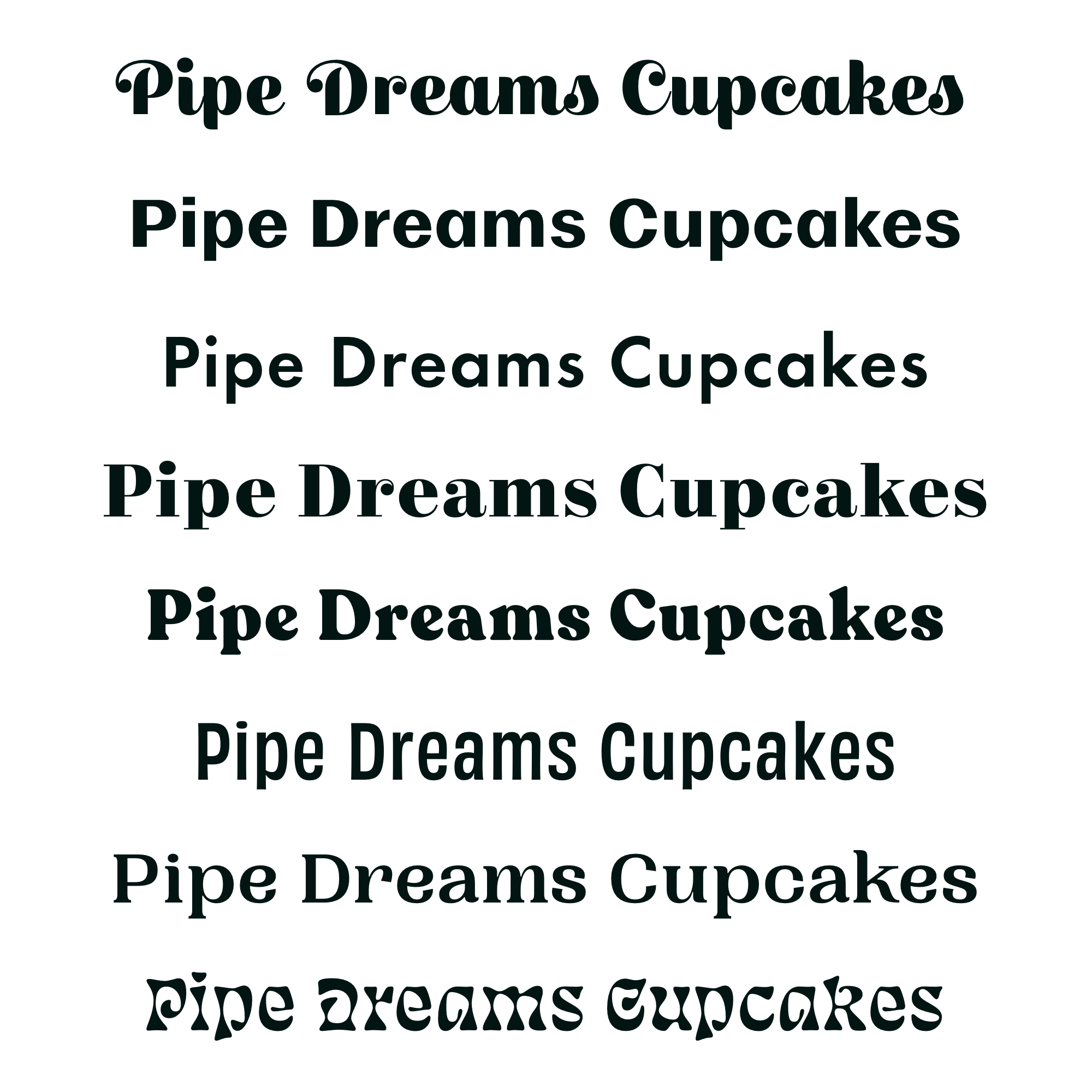 Type experiments.
 Some early iterations of the logo testing out different type.
I’m really happy with the balance between vintage and fresh we landed on. I used Obviously for the type, which has subtle curves mimicing hand-drawn letters, and the company initials are hidden in that center mark.
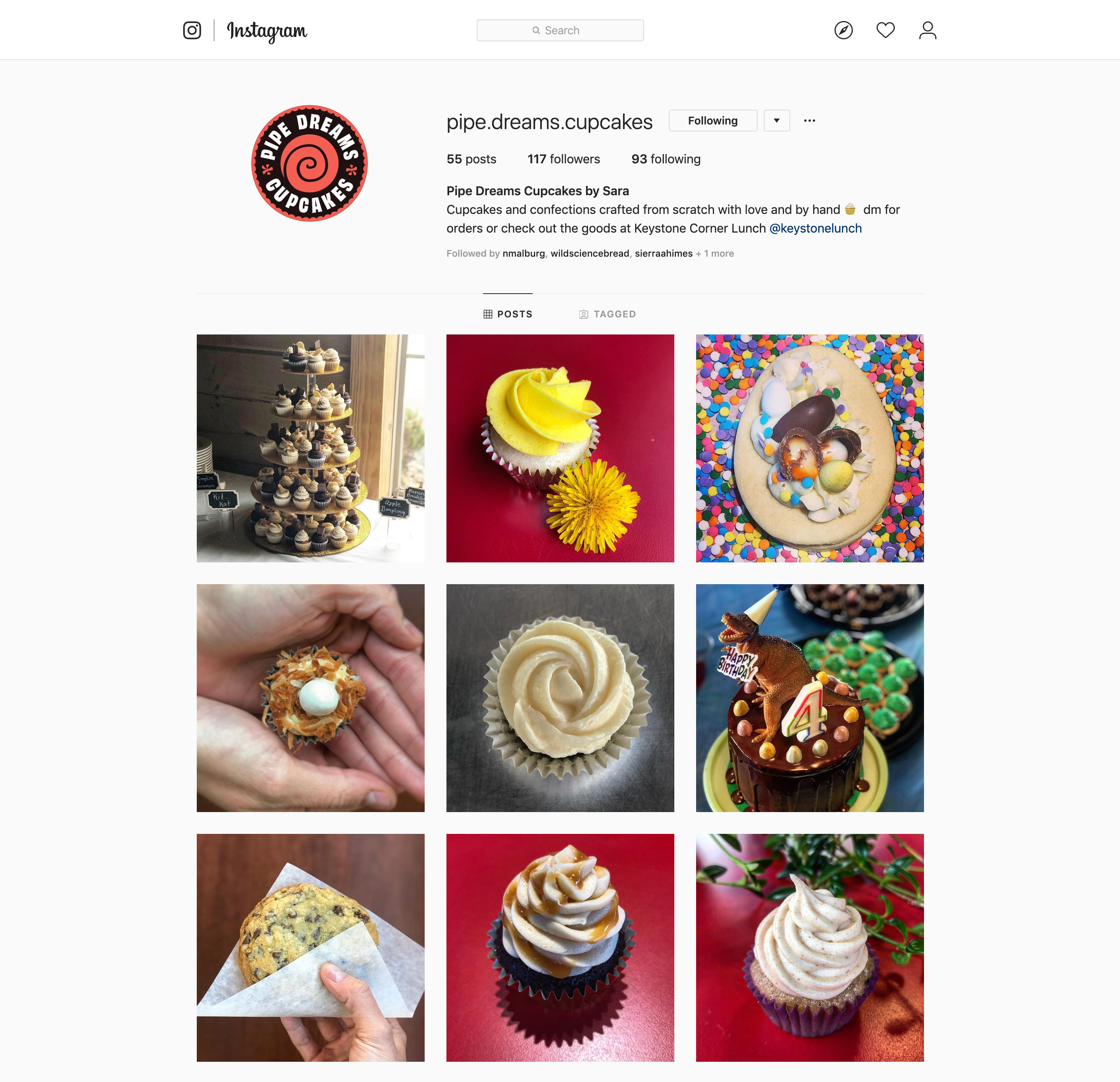 The logo in use on instagram.
Thanks for taking a look. Reach out anytime. I hope you’re having a nice day :)Copyright © 2013-2020 Steven Lewis